Ella Jones
Ella Jones
Brand Identity
Brand Identity
TIMELINE
TIMELINE
Sept-Dec 2025
Sept-Dec 2025
CLIENT
CLIENT
Menopause Marathon
Menopause Marathon



CONTEXT
Menopause Marathon is a project dedicated to raising awareness and funding for women's health and research online and by hosting marathons across North America. I was tasked with creating a logo and brand identity package.
Menopause Marathon is a project dedicated to raising awareness and funding for women's health and research online and by hosting marathons across North America. I was tasked with creating a logo and brand identity package.
PROBLEM
PROBLEM
The challenge of creating a brand image which requires support from many communities (in this case; researchers, women, and feminists), is that the approach needs to be broad enough, yet feel authentic to the brand and its values.
The challenge of creating a brand image which requires support from many communities (in this case; researchers, women, and feminists), is that the approach needs to be broad enough, yet feel authentic to the brand and its values.
SOLUTION
SOLUTION
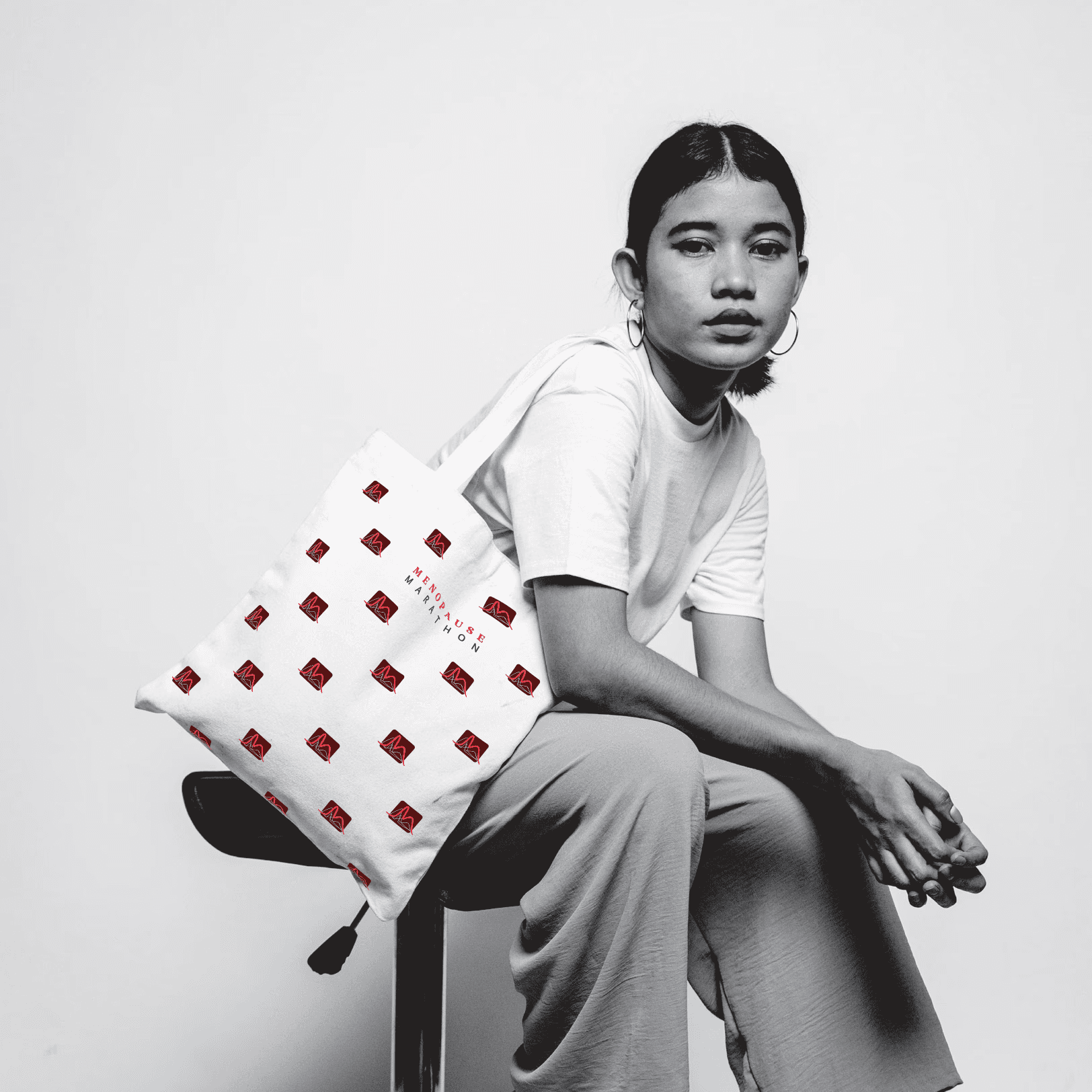
The "M" indicating the brand name, is a part of the logo mark showing the monthly hormonal cycle of women. Anyone going through hormonal changes as well as researchers and scientists will recognize the cycle. Since the brand name is self-explanatory, more liberty could be used for the logo mark. Additionally, the brand stands out in the medical industry by not presenting in the usual sterile blue and white colour combination, and cold sans-serif typography. The simplistic form allows the brand to seem approachable and the bold, striking colours were chosen to indicate strength and resilience (core values of the brand). The Menopause Marathon logo represents a clinical approach with personable traits which allows many audiences to connect with the brand.
The "M" indicating the brand name, is a part of the logo mark showing the monthly hormonal cycle of women. Anyone going through hormonal changes as well as researchers and scientists will recognize the cycle. Since the brand name is self-explanatory, more liberty could be used for the logo mark. Additionally, the brand stands out in the medical industry by not presenting in the usual sterile blue and white colour combination, and cold sans-serif typography. The simplistic form allows the brand to seem approachable and the bold, striking colours were chosen to indicate strength and resilience (core values of the brand). The Menopause Marathon logo represents a clinical approach with personable traits which allows many audiences to connect with the brand.
NEXT STEPS
NEXT STEPS
As for the brand identity, I created a baseline brand guide which would need to be updated overtime as the brand expands.
As for the brand identity, I created a baseline brand guide which would need to be updated overtime as the brand expands.
